
By Beauty Bay Pastels Pressed Pigment Palette Review + 3 Looks Demo
Do you want to literally glow up overnight using the Light Feminine method? Click here!
Hey, pretty people!
If you love colors, you most definitely have heard about this palette before.
It is one of the most recent additions to the By Beauty Bay range, and one that immediately caught the attention of many.
Beauty Bay is one of my favorite website for makeup, and I was quite excited to try out one of their own formulas. Pastel shades can be quite tricky to start with, though.
I want to start off this review by putting out an important disclaimer. If you aren’t really experienced using pastel shadows, I would recommend reading and watching many reviews before purchasing.
Pastels can give you immense payoff and create the cutest looks, but they need a proper prepping technique. Also, they must be treated with more care compared to your regular eyeshadows.
So, that being said, are you curious to find out what’s the deal with By Beauty Bay Pastels Pressed Pigment Palette?
Let’s find out!
GENERAL SPECIFICS
- 10$ | 10£ | 12€
- 8 shades total
- 8 matte shadows
- Net Wt. 8 x 0.05 oz. (1.5 g)
- 12 months shelf life
- Mirror-equipped
- Cruelty-free
- Vegan
- No brush
- Pastel eyeshadows
You can find the full list of ingredients on beautybay.com.
PACKAGING
 This packaging is simple, polished, and yet incredibly well thought-out.
The palette comes in a lovely pastel cardboard with no distracting designs on it. I find it to be perfect to advertise the product effectively. Moreover, the glassy and white writings stick out quite well on it.
If I had to pick a downside, it would be that it is slightly difficult to read the writings on the front; other than that, I find this cardboard to be nice to look at.
THE ACTUAL PALETTE
 Once we take the actual product out of the cardboard, we can immediately see that the pastel theme is very much present.
The white writings pop a lot more on this pastel background however, once again being overall polished and elegant. On the back, we can find a few advertising words about the palette.
THE INSIDE
Opening up the product, we can finally get a good look of the shadows and the mirror.
 Speaking about the mirror, it is quite a nice one; the quality is overall good, and the size allows you to complete your eye look with it effortelessly. It is not ideal for your entire routine, but will get the job done when it comes to eyeshadows.
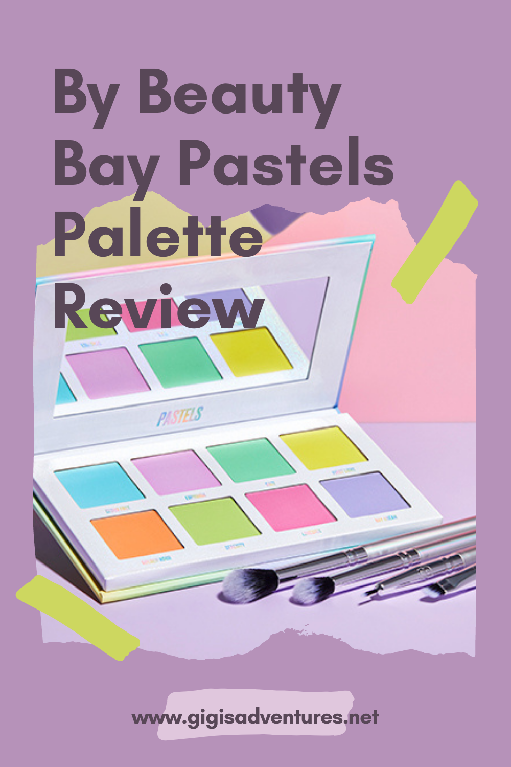
Since the palette only contains 8 shades, the pans are quite bigger than the average ones, and hold slightly more formula than them. Every color has name printed in pastels directly under them, which I deeply appreciate, and the white background is enriched by colorful yet subtle glitters.
I enjoy this packaging quite a bit, even though some people may find it to look slightly childish. The designs are fairly simple, and the colors are bright and vibrant.
SHADES’ SELECTION + BREAKDOWN
As you have guessed from the name of the palette, this shades are only matte pastels.
This shadows are simply amazing for spring and summer looks. However, they can give a pop of color to any eyeshadows of your choice. The best feature about them is that they are all mattes, meaning they can work either alone or paired with shimmer or glitter shadows.
 Now, when I started this review I stated that pastels can be slightly tricky to work with; they do need a little bit more caution, but a few easy tricks can help you out.
Firstly, you will need a white base. No, you can’t use a simple concealer or any other eye base that isn’t white. Don’t believe me? Try it out for yourself.
I did know about this requirement when I firstly tried using the palette, but I decided to try applying the shadows with a simple concealer base. Whether you set it or not, the shades simply won’t show up, and when they will they will look a chalky, patchy mess.
We will touch about this subject even more at the end of the post, so stay tuned for more infos.
ROW #1

Cloud Free. The first row starts with a beautiful light blue shade, which also looks kind of icy in the pan. This eyeshadow is quite pigmented, although I would say it is one of the less pigmented ones, but creates a bit of build-up in the pan. Using a soft brush and a light hand is essential here. The major upside is that it literally blends in a second!
Euphoria. Halfway between a periwinkle, a lilac and a baby pink color, this shadow is quite a powdery one. However, that also means it is one of the most pigmented of the palette, too. One thing you will need to keep in mind is that the color will turn out to be a lot more pink on the eye than it does in the pan. In fact, it almost looks like a proper baby pink shade. I definitely had a good time working with it, although the pigmentation does get a little lost once blended out. Aside from this, it is a great shade to use!
Daze. I look at this shade as the more unique version of ‘Serenity‘. In fact, if the latter would be the most common shade for a pastel palette, the former is a bit of an unusual one. ‘Daze‘ is a nice, cool-toned green eyeshadow, and I personally think it adds a bit of fun to this colorful product. The cool undertones become even more prominent once applied on the eye, and it has an overall good pigmentation. The best part is that it is well-pressed, and has no build-up or fallout whatsoever!
First Light. I believe that a yellow color could potentially be quite hard to create for a pastel palette. It could be too bright, offering a neon effect, or too tame, barely even visible on the skin. This yellow shade is definitely more of a cool-toned choice, but its bright and neon element gets a little lost when applied on the eye; in fact, I didn’t really find anything special about it – for me. The color is a bit faded, and turn somewhat neutral on the eye. It is an OK shade overall, I just didn’t find anything too special about it, personally.
ROW #2

Golden Hour. This orange shade looks bright and almost neon in the pan, and yet holds a faded look to it as well. I find it to be an interesting addition to the palette, kind of a wilder element, compared to the other shades. Once applied on the eye, this shadow turns definitely nice and bright, but looses a bit of its original pigmentation once blended out. A lotta bit, actually. You will need a little bit of reinforcement and blending out to reach the perfect look, but I must say I am a fan of the end result!
Serenity. A lime green shade that will surely star in many people’s inner corners, I am sure of that. Serenity is another nicely pigmented color, but creates the tiniest bit of build-up in the pan. It is a very small issue, and using a gentle hand and a soft brush will get rid of that immediately. Moreover, it blends out incredibly fast!
Lovesick. This warm salmon pink shadow is definitely one of the most pigmented ones of the palette, if not the most pigmented one. However, it does create a little bit of build-up in the pan. It is not as prominent as ‘Cloud Free‘, but it’s also something worth mentioning. Once again, use a light hand and proceed slowly whilst picking it up!
Day Dream. The palette closes off with a majestic periwinkle shade, the perfect hue to complete this color scheme, in my opinion. As you would expect from such a shade, it has a strong cool undertone that becomes more prominent once it is applied on the eye. Moreover, it has a subtle blue hue to it. I genuinely enjoy using this shade, although it does need a bit of building up for the periwinkle element to become the star of the look. Other than this, it is a pretty good shade to work with!
DEMO #1

After prepping my eyelid with the Cut Crease Canvas in ‘Halo White‘ by Revolution (review here), I created an elongated cut crease shape with ‘Euphoria‘. Then, I set my lid with ‘Serenity‘. I used ‘First Light‘ as my inner corner highlighter, and swiped ‘Daze‘ on my lower lash line.
DEMO #2

After prepping my eyelid with Halo White, I set the inner portion with ‘First Light‘, the middle with ‘Golden Hour‘ and the outer part with ‘Lovesick‘. Then, I created a winged eyeliner. To finish the look off, I swiped ‘Cloud Free‘ on my lower lash line and popped ‘First Light‘ in my inner corner.
DEMO #3

After prepping my eyelid with Halo White, I set the inner portion with ‘Lovesick‘, and the outer one with ‘Day Dream‘. Then, I popped on a winged eyeliner. I mimicked the same shape on the lower lid, but inverting the colors. Lastly, I popped on a pair of false eyelashes.
FINAL THOUGHTS
This has been a farily long ride!
In conclusion, would I recommend Beauty Bay Pastels palette? I would!
There is a lot to un-pack about this product, and a lot of small details about it and tricks you need to have up your sleeve if you want to make the most out of it. Let’s break a few of those thing down!
 THE ‘ISSUE’ WITH PASTELS
Like I stressed multiple times throughout this review, pastels cannot be treated like ‘normal’ matte shadows. They need a proper prepping technique, a careful hand and a bit of patience.
There is only one way to prime your eyelids for pastel eyeshadows, and that is a stark white base. I know that your trusted primer and concealer do a wonderful job at keeping your eye look in place all day, but they won’t help pastel hues show up at all. You can try how many times you want to, but the results will always be disappointing.
I have used my Cut Crease Canvas in ‘Halo White‘ by Revolution, but that isn’t the only white base on the market. Feel free to use whichever brand you prefer and trust, as long as they offer you a stark white effect!
THE ISSUE WITH PASTELS, PART 2
The other big aspect about pastels you need to remember is that you can’t absolutely espect to treat them like regular mattes.
Makeup offers multiple formulas and finishes you can work with, and you need to be mindful of that. You can’t approach a shimmer shadow like you would approach a matte, and you certainly cannot compare pressed glitters to satin shades. Pastels, as you may have guessed, are a category of their own.
They are an incredibly sensitive variety of mattes, and they need a soft hand to handle them. They are usually slightly powdery, and their pigmentation isn’t exactly the best ever; hence why the white base. Packed, sturdy brushes are a good choice to get the most pigmentation on the eye, but they can also create a bit of build-up in the pan. That’s exactly why you need to procede with a cautious hand.
IS THIS PALETTE WORTH IT?
Now that we have all of these premises down, let’s answer the million dollars question: is this palette actually worth it? I do believe it is.
When you satisfy the requirements pastel shadows need, you will find how amazing this product is. The pigmentation is overall good, but the blendability is what will blow you away. A couple of brush strokes will create the perfect blurry effect, and if you have packed enough formula on the eye before you won’t need to reinforce the pigmentation.
LAST FEW CONSIDERATIONS
Lastly, allow me to share a few considerations with you.
Ever since I have started studying as a makeup artist, I have found that there are so many formulations, finishes and techniques in the beauty world I had never even considered before.
One of the most prominent realizations I have come across is that jumping on a trend has its ups and downs for many people. That’s especially true if your makeup knowledge isn’t too vaste.
I want to stress the fact that I do not mean to offend anyone with this statements. That is actually the opposite of what I want.
The only thing I intend to say is that you need to be informed about the product and its formulation, before leaving a negative review.
I believe that many people were so in love with pastel colors that bought the palette mindlessly. They didn’t really know how to approach them, and that’s where the bad reviews came from.
I really hope that you will give this product a second chance soon. Especially knowing all the premises and tricks it needs for working properly. Please, don’t feel like I was trying to bash you or your initial judgement. I, myself, have made so many mistakes in my makeup journey, and still make them.
Let’s all grow and learn together through this journey!
MORE FASHION AND BEAUTY ARTICLES HERE