
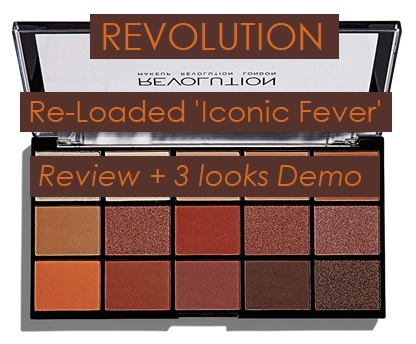
Revolution Re-Loaded “Iconic Fever” palette Review + 3 looks Demo
A warm tones’ lover dream, the ‘Iconic Fever‘ palette from the ‘Re-Loaded’ series by Revolution is one of the greatest deals the British brand could offer, currently retailing at 7$ for 15 shades.
Despite the obvious similarity with Urban Decay’s ‘Naked Heat‘ (read more about it here!), people started praising the drugstore palette as one of the best. But is it really, though?
Let’s find out!
GENERAL SPECIFICS
- 7$ | 5£ | 4.99€
- 15 shades
- 15 x 0.04 oz. (1.1 g)
- 0.46$ x shade (0.3£ | 0.3€)
- 1 satin shade + 5 shimmers + 9 mattes
- 12 months shelf life
- Vegan
- Cruelty-free
- Gluten-free
- Warm browns, burnt oranges and intense siennas
Find the full list of ingredients at revolutionbeauty.com.
PACKAGING
 One wouldn’t really expect that luxurious packaging when it comes to a 7$ palette, and that’s exactly what you get. If you’re into some kind of aesthetic in makeup products, this one may not be your cup of tea.
The palette itself isn’t neither too big or small, and is quite a nice size if you intend to travel with it, in my opinion. To briefly touch on its weight, I find it to be leaning more towards the lighter side; this aspect is furtherly reinforced by the somewhat cheap hard plastic packaging.
 The front of the product has a clear ‘window’ that allows us to see the shades inside, framed by black details and golden writing. In general, this packaging’s front is probably the detail I enjoyed the least out of the entire product; the plastic scratches way too easily, and the writing rubbed off in a matter of days.
On the back, we can find the usual sticker with all the general specifics of the palette.
I am clearly not a big fan of this packaging in general, but I have to admit that it’s not the end of the world, either. The product inside should be the star anyway, and that’s exactly what we are about to examine.
SHADES’ BREAKDOWN
Before we jump straight into every shade’s description, I just wanted to point a couple of things out.

Much like the rest of the palette of the ‘Re-Loaded’ series these eyeshadows do not have a name, which is why I am going to refer to them with the number they occupy in the palette.
The second disclosure I would like to make is all about the colors’ formulations. This palette is marketed as a selection of only mattes and shimmers, but I personally find the second color to be more of a satin than anything else.
Allright, let’s jump right in!
ROW #1
![]()
#1. This white/light beige shimmers gives out beautiful golden sparks that make it a great highlighting shade for lighter skintones. It’s most definitely not the most pigmented shadow out of the palette, but I have to admit it’s not a desperate situation; formulation-wise, this shimmer feels soft and is not crumbly. You would need to wet your brush for it to work perfectly, but it’s 100% worth it.
#2. Marketed as a matte, I find this light beige shade to resemble a satin finish more than an opaque one. Initially, I thought about using it as an overall base, but upon coming across its slightly shiny finish I opted for inner corners and brow bone highlights. I had no issues regarding pigmentation or formulation, though.
#3. If you have a light (or pale) skintone and look for the perfect soft transition, look no further; this beige color is going to give your eyes a good initial definition, and could also serve as a base for medium skintones. Great pigment and formulation.
#4. Another beige transition/crease shade, this time a little warmer than the previous one. Once again, I find its pigmentation to be quite impressive, as well as its smooth and blendable formula.
#5. The last shade of the first row is a light brown color that could easily double up as a crease shadow for lighter skin tones and as an overall base for medium ones. As the shades we have just examined, it has fairly good pigmentation and a very good formula and general feel.

ROW #2
![]()
#6. This brown matte looks slightly ashier in real life than it does on the website; it would be a cute eyebrow shade, though! I really like its pigment, even if it makes a little impact since it’s not super dark, and also its soft formulation.
#7. A copper shimmer with subtle golden reflexes that will make heads turn, that’s for sure. I appreciate its pigmentation, but as most of the shimmers out there this one works best with a wet brush or just your fingers. It’s very smooth and doesn’t crumble, though.
#8. This burnt red matte comes across as a warm brown to me when I apply it onto the skin, but can be built up quite nicely. Its pigmentation is not one of the best out of the palette, and the shade feels a tiny bit drier than the rest. Other than this, a pretty cool shadow!
#9. If you’re a fan of the copper shimmer from before, you’ll be delighted to know this one it’s basically the same shade but with a lot more red to it; I was kind of skeptical at first, thinking that this and #7 were exactly alike, but upon swatching and using it I was proven wrong. It does need a wet brush or finger to work perfectly, but the colors are quite different from one another.
#10. This last shimmer of the row is one of the most pleasant to work with, mainly because it has the softest and most buttery formula of all. For what concerns its color, I find it to fall between shade #7 and #9, keeping the golden sparks alive in the application.

ROW #3
![]()
#11. This matte orange is honestly the best out of my entire collection. Unfortunately, when my palette arrived, this shade was broken and I had to patch it up (learn how to fix your broken powders in 5 minutes here!), so I can’t really speak about its original formulation. Its pigmentation, however, has me shook to the ground.
#12. Another terra-cotta matte, just a little deeper this time. I personally love everything about this shade, from formulation to pigmentation, and I also find it to be one of the best ones out of this shadow selection.
#13. Much like the previous shade, this burgundy matte has an excellent pigment and even better formulation. To me, it almost looks like a mixture of shades #12, #8 and #14; perfect for creases and outer corners, it just won’t disappoint you.
#14. Easily one of my favorites, this deep reddish-brown matte is one of the shadows I use the most not just when playing with this palette. The pigmentation is outstanding, that’s without question, but I do find it to be slightly (very slightly) powdery. It’s almost impercettible, though!
#15. A deep copper-burgundy shimmer that’s also one of my favorite shades out of the palette. If you want to go for a fall-ish smokey eye, you need to try this shade out at least once! I feel like this shade uses color #14 as a base, and tops it with #7. Outstanding formulation, even better pigment.

DEMO #1

I started the look off by priming my eyes and setting it with some powder. Then, I packed shade #14 on the outer corner and blended it out with the help of shades #4 and #3; I used color #1 all over the lid and shade #2 as my inner corner highlight. Lastly, I used a purple eyeliner on my waterline and shade #14 under my lower lash line.
DEMO #2

On a set base, I packed a mixture of shades #12 and #8 on my inner and outer corner, blending them out and into the crease with shades #5 and #6. For the center of the lid, I applied color #7 with a spotlight of #9; I swiped shades #12 and #8 on my lower lash line and added a spotlight of #10 in the middle. #2 is my inner corner highlight.
DEMO #3

On a set base, I buffed a mixture of shades #11 and #5 into my crease to create initial definition; then, I quickly deepened my outer and inner corner with shade #13, reinforcing that with shade #14 and mimicking the halo style on my lower lash line as well. I applied shade #15 on the center of the mattes and used shade #10 as my inner corner highlight.
FINAL THOUGHTS
So, what do we think about the Re-Loaded ‘Iconic Fever’ palette?
In all honesty, it’s one of my favorites! I find myself gravitating towards it pretty much on the daily, and definitely think it’s a staple for fall.
One of the aspects I was able to appreciate the most is the fact that each row can be used to create a single look; you have your neutral/everyday, the warmer one and the straight up smokey one. Another detail I liked is the fact that the palette actually has crease/transition shades for darker skintones, especially that beautiful orange one.
The quality of the palette, however, undoubtedly takes center stage. I did have a couple of powder issues – especially with the lighter mattes – but they were so minor they’re barely even worth mentioning; the true stars are the softness and pigmentation of the colors, especially the mattes. I wet my brush for a couple of shimmers (#1 and #9), but the other worked perfectly without any help.
Have you tried this palette? Are you going to? Let me know!